![Photo of [Your name]](images/your-photo.jpg)
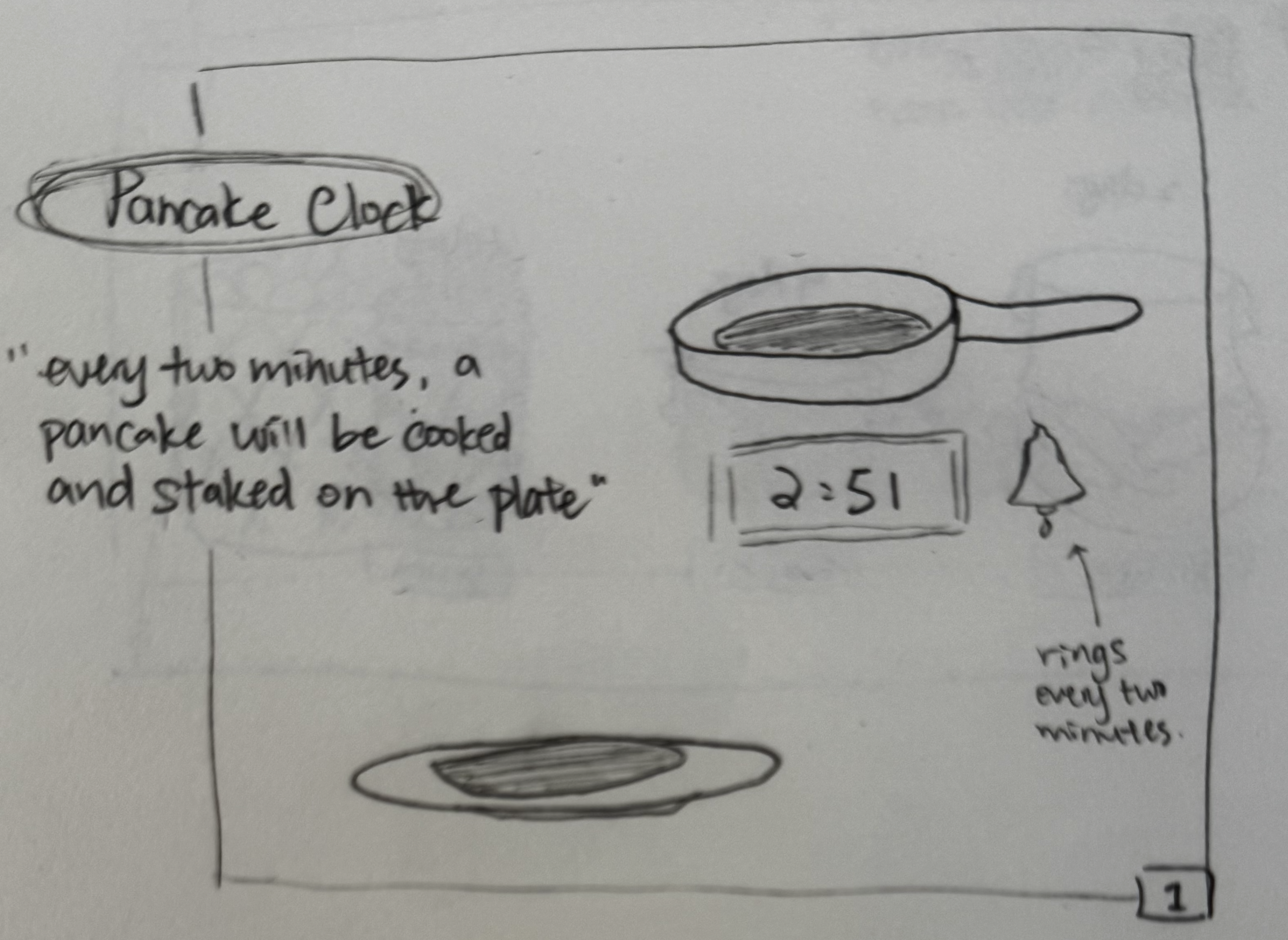
Final Clock 1
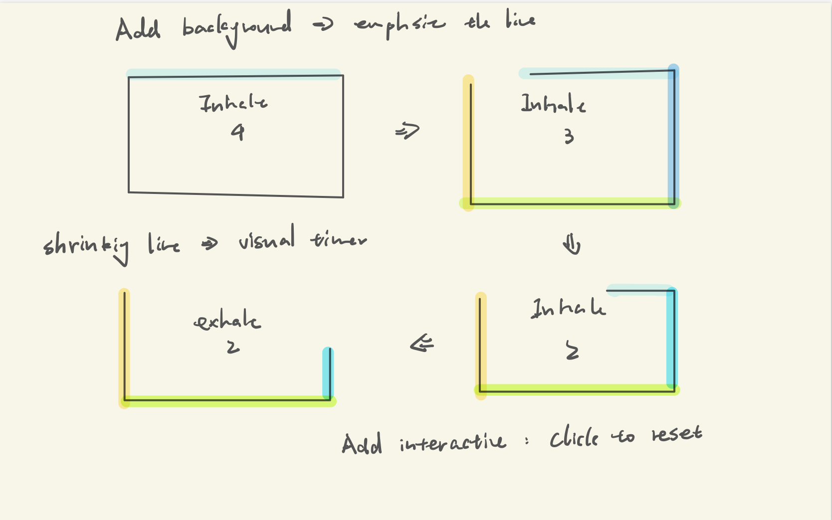
Design process:
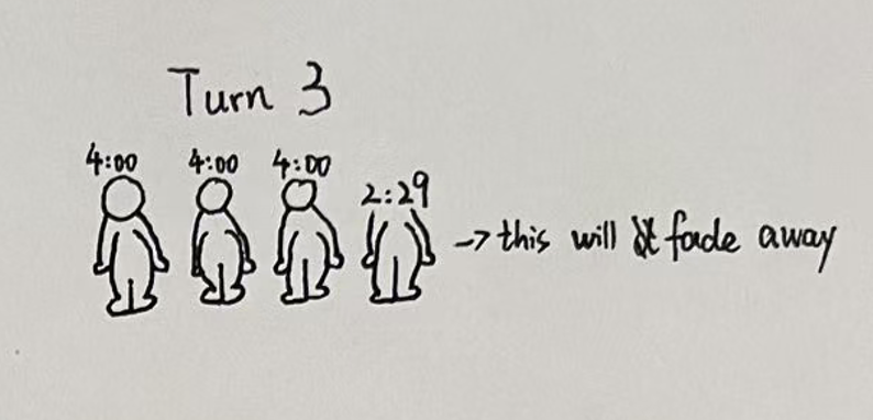
Step 1 – Avatar-Based Time Representation
The initial concept represents each speaker as an avatar with a fixed amount of time.
Each avatar includes a timer and gradually fades away as the speaking time decreases.
This establishes a direct mapping between time and visual change, allowing users to intuitively understand how much time remains.
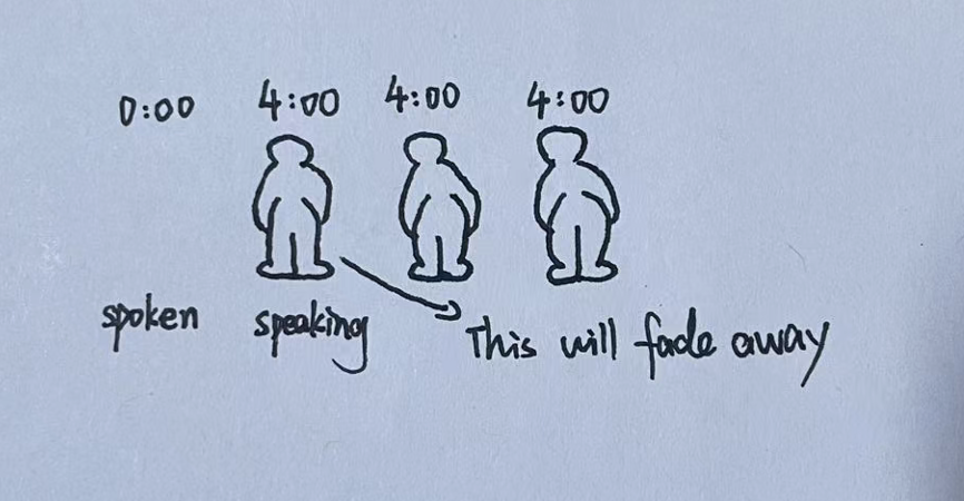
Step 2 – Adding Speaking Status Labels
To improve clarity, labels such as “speaking” and “spoken” were added to indicate the current speaker and those who have already finished.
This enhances readability and provides a clearer structure of the speaking order, helping users quickly understand the flow of the discussion.
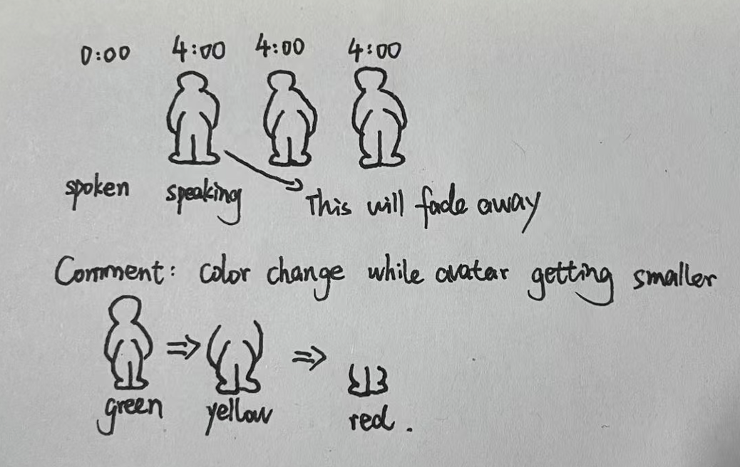
Step 3 – Color Gradient for Urgency
To make the passage of time more visually intuitive, color transitions were introduced, where avatars change from green to yellow to red as time runs out.
This strengthens visual hierarchy and urgency, allowing users to quickly assess remaining time at a glance without focusing on numerical values.
Self-reflection / future work: One improvement would be to refine the visual transitions, making the fading and color changes smoother and more continuous. This would improve readability and make the passage of time feel more natural. Another improvement would be to introduce interaction, such as allowing users to adjust speaking time or manually switch turns. This would make the system more flexible and adaptable to different meeting formats and group sizes.